I like math and I like the Bible so I thought, “why not put them together?” So I decided to look at the first recorded genealogy in Genesis 5. It’s a fairly standard, 10 generation list of descendants. Adam had Seth had Enosh… I’ve probably read this passage 50+ times. I put all the dates into an Excel document and then worked some Python magic (code in appendix).
Right off the bat there are some really interesting things that jump out.
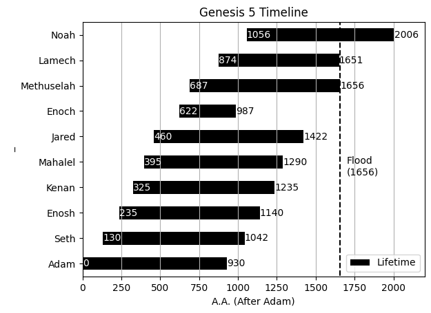
- Adam almost met his great-great-great-great-great-great-great grandson, Noah. He missed him by about 124 years. Seth was even closer and missed Noah by 8 years.
- Enoch was taken from the world 57 years after Adam died (“Instead of saying Enoch died, the text simply says he no longer was present… Similar language is used of Elijah’s departure from this world (see 2 Kgs 2:10)”, NET Translator Notes).
- Methuselah died the same year the flood came (“In the six hundredth year of Noah’s life, in the second month, on the seventeen day of the month”, Gen. 7:6). It is very likely that he died in the flood.
- There are two millennia packed into this one chapter. Dang! I’m sure someone’s done the population growth modeling on that.
I love data visualization and I’ve been wanting to start going through the Bible for awhile and make some plots. Where should I go next?
Appendix
| Generation | Name | Birth | Before Fatherhood | After Fatherhood | Lifetime | Death | Notes |
| 1 | Adam | 0 | 130 | 800 | 930 | 930 | |
| 2 | Seth | 130 | 105 | 807 | 912 | 1042 | |
| 3 | Enosh | 235 | 90 | 815 | 905 | 1140 | |
| 4 | Kenan | 325 | 70 | 840 | 910 | 1235 | |
| 5 | Mahalel | 395 | 65 | 830 | 895 | 1290 | |
| 6 | Jared | 460 | 162 | 800 | 962 | 1422 | |
| 7 | Enoch | 622 | 65 | 300 | 365 | 987 | Gen. 5:24, ceased to be |
| 8 | Methuselah | 687 | 187 | 782 | 969 | 1656 | |
| 9 | Lamech | 874 | 182 | 595 | 777 | 1651 | |
| 10 | Noah | 1056 | 500 | 450 | 950 | 2006 | Gen. 7:6, age 600 when the flood came (1656) |
import matplotlib.pyplot as plt
import pandas as pd

fname = 'Genesis 5 Timeline.ods'
gen5_data = pd.read_excel(fname)

# barplot
ax = gen5_data.plot.barh(x='Name', y=['Birth', 'Lifetime'], stacked=True, color=['none', 'k'],
                         label=['_', 'Lifetime'], xlabel='A.A. (After Adam)', ylabel='_', title='Genesis 5 Timeline')

# bar labels
ax.bar_label(ax.containers[0], color='w')
ax.bar_label(ax.containers[1])

# flood indicator
ax.vlines(x=1656, ymin=-10, ymax=10, ls='--', color='k')
ax.text(x=1700, y=3.5, s='Flood\n(1656)')

# axis styling
ax.xaxis.grid()
ax.set_xlim(0, 2200)

Leave a comment